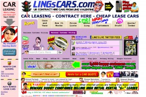
Don’t Make Your Customers Run For The Hills

Worst website ever?
Great news….somebody has visited your website. Hurrah! Perhaps they might buy your product or decide to use your services…but wait…oh NO! They are leaving again. “What?” you cry, “They only stayed for 5 seconds”.
I’m sure your website doesn’t look like the example I’ve found but yes, they stayed long enough to be not interested in your website and then made a quick exit to one of your competitors. If your site is not converting visitors to sales, then you might be committing one of these deadly mistakes:
1. Flash Driven Design
Search engines hate Flash driven design. In fact they hate them so much that they will completely ignore your site no matter how pretty you think that it looks.
So what if it is clever and it contains beautiful state of the art design? Nobody is ever going to see it. Google is just going to skip right past your site as if you are the invisible man. And those millions of iPhone and iPad users who use their mobile devices instead of their desktops certainly won’t see it because they can’t see Flash on their phones.
It is pointless to annoy Google so much it chooses to ignore you. It’s YOU that won’t get any visitors. Just because you can add whistles and bells doesn’t mean that you should.
2. The Annoying “Welcome to our website”
How long do you think you have to grab your visitor’s attention? Here’s a hint: It isn’t 2 minutes, 1 minute or even 30 seconds. It is more like 10 seconds. That is all the time you have, so don’t waste it with a boring introduction.
Most people don’t like to read much on the online, so when they first visit your website they are probably just going to quickly scan it to see if anything catches their eye. Why would you want to squander an already tiny attention span by reminding people which site they are visiting? Instead, try and use an attention grabbing headline. Try and imagine yourself as your customer. What would you want to know first?
People should already know where they are just from glancing at the top of your site, where they should see your logo and a snappy tagline, or a short description of your site, so there is absolutely no need for stating the obvious with a “welcome to our website” message. Yawn!
3. “We…. We… We… We… We…zzzzzzzz”
“We have a team of….”
“We plan to….”
“We have been in business for…..”
Sorry to sound blunt but. . . NOBODY CARES! Well they do actually but the point is to make you think about your customer and what they are interested in.
Visitors to your website are only interested in one thing: What is in it for ME?”
If your site doesn’t answer this question pretty quickly they will leave.
Instead of just talking about you and your site or your business, imagine that you are talking one to one with one of your typical customers and ‘speak’ to them as an individual. Tell them how your product or service is going to benefit them. By all means tell them a bit about yourself and your business on your ‘About’ page to establish credibility but don’t labour it and keep your home page for your visitors.
4 . Tech Speak
Every industry and business sector has its own tech speak and industry only words that nobody else understands.
Try talking to friends and family about Autoresponders, SEO and long tail keywords and you’ll see their eyes glaze over as they slip into a coma.
If you use words, terms and phrases that mean something to you but go straight over your visitor’s heads, then you are going to lose them. We’ve already said visitors are going to scan over much of the content on your website anyway, so it makes sense to make it as easy as possible for them to be able to pick out and understand the main points from the bits that they do read.
5. No Clear Call to Action
As well as telling your visitors “what is in it for them”, your next job is to tell them what they need to do now.
It is absolutely pointless giving them great reasons why they should use your products and services, and then not tell them what they need to do next to get it.
You need to have a clear call to action AND make it blatantly obvious what you want them to do.
Do you want them to ring you up for a free quotation? Then tell them!
However, telling them to ring you and then hiding your number somewhere on your website is another big fail. If your call to action is telling them ‘RING US RIGHT NOW’, then make sure you put your telephone number right next to it.
Do you want them to click on the ‘Buy Now’ button? Again, you have to tell them, and then show them clearly where that Buy button is.
And don’t try to cleverly disguise the button or link. Make sure that it is bold and clear enough for them to see what they need to press.
Never assume that your visitors will know what to do next. S-P-E-L-L I-T O-U-T for them. Tell them what you want them to do. If you make it difficult for them, then they will leave. Yes, they probably could figure it out….but they won’t! They will move on to the next site in the blink of an eye.
QUOTE : You invest a LOT of time and money encouraging people to visit your website. So why scare them off by making one of these fatal mistakes?
PS: If you got this far and you really want to see that website then click here.
